Different satellite missions are conceived of and implemented by different
groups of people. The inevitable result of this — much as I've been
known to grumble about it — is that the data that flow from these
missions come in many different formats and have many (at times vexingly
unwieldy) file-naming conventions. C'est la vie; we must embrace the
differences if we want to make something beautiful. (As Bob Dylan wrote,
"Behind every beautiful thing, there's been some kind of pain".)
I am going to try to describe some of my processes for creating imagery
from satellite data. Each example will vary — more or less —
as the input data vary. Other sources of variation arise when I choose to
reproject the data, or when I merge data from more than one source file
into the final image.
Just as the steps themselves will vary, you, the reader, will find that
there is more than one way to do each of the steps. Hopefully, I can
convey the idea of what I am trying to do, and you can choose a method
that works best for you to accomplish the same (or a better) result.
Some Tools
Before I begin, I thought I would list some of the software tools I use
during image creation. You can refer to the links below if any of the
tools I am using are unfamiliar to you.
The first step to making a compelling image is to find an interesting
subject. Here you start with a decided advantage. We are making images of
Earth, and I've found that our home is
beautiful when viewed from above even when
something bad
is happening down below. Perhaps the real challenge lies in selecting
one small portion of ouir planet to focus on. To that end I rely on a few
tools in addition to our standard ones
that let me browse the data.
Most mornings I start with the first two browsers in the above list and
look for regions that have interesting features (this is highly subjective)
with a minimum of cloud cover (unless the features of interest
happen to be in the clouds).
If I find something promising I'll usually download the standard
level-2 file
from our archive to have a look at the chlorophyll field, unmapped, and
in the native resolution of the sensor. Now, the
SeaDAS software distributed
by our group will allow you to do this, but I have put together a
small perl script
that I use instead that is sufficient for my purposes.
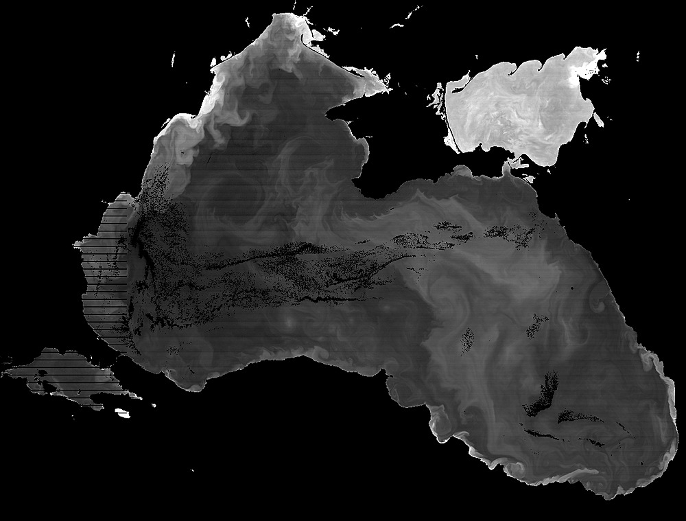
As an example, I see
here
that chlorophyll values were successfully computed for much of the Back Sea
on August 25, 2020. So I
click on that scene
and use the provided link to download the level-2 OC file. I then incant
the following — choosing the low and high chlorophyll concentrations
based on what I saw in the browse image.
In this case, I saw the following (cropped and scaled for inclusion here via
    l2chlorimg.pl 0.15 20 V2020238103000.L2_JPSS1_OC.nc | \

    convert - -crop 1450x1100+740+1800 +repage -resize 1000 -sharpen 0x1 \

    V2020238103000.L2_JPSS1_OC.crop.jpg
).
The above view of the data is already enough to tell me that there might
be something worth making an image of here, but that there may be
glint-related striping issues to deal with in the western half of the
basin. (Note that the horizontal black lines on the left side of the
above image are not caused by detector artifacts but by the
bow-tie deletion strategy used for
VIIRS data. Such black lines would disappear once the data were projected
and gridded into a final image raster.)
Landsat 8
I also like to keep an eye out for good Lansat 8 passes. Landsat 8 has
better radiometric quality with respect to ocean color than previous
Landsats, and it has higher resolution (30-meter, multispectral) than
our standard set of ocean color missions.
A good correspondence to note when using the WorldView browser is that
(as long as Terra does not drift too far from its current orbit) the
interorbit gaps in the Terra/MODIS coverage
line up nicely with the
Landsat 8 orbit. This means that if you're looking at the Terra
daily coverage and notice an interesting feature right at the gap,
then there's a good chance of Landsat 8 coverage of the region as long
as there is land in the picture.
As I write, I notice that the 28 August 2020 Terra/MODIS coverge has a gap
right over Australia's Capricorn
Channel. Now I know that this region is prone to Trichodesmium blooms,
and I know that the bloom season is starting soon, so I decide to find and
download the corresponding Landsat 8 scene to see if anything is there.
The file that I download from the USGS EarthExplorer mentioned above is
named LC08_L1TP_090077_20200827_20200828_01_RT.tar.gz .
I wrote an even smaller perl script to unpack
the Landsat 8 tar file, create a histogram-equalized version of the
red, green, and blue bands, and display the result. The script invocation
looks like this for the example tar file.
The resulting image displayed on my monitor (a cropped and scaled down
piece is shown below) leads me to decide that — while I do see some
likely Trichodesmium slicks — the features aren't strong enough to
make a compelling image and that there is too much sun glint and aerosol
reflectance muddying up the view.
Earth is Round, But My Screen is Flat
Before you decide to make an image from satellite data, you should be
aware that you will most likely want to project the data in some way.
Orbiting platforms usually do not collect imagery in the same way that
your camera does (i.e. a nice rectangular array of pixels all at once).
There are exceptions such as the photographs taken by astronauts, but
even those are distorted simply because Earth is round while the camera
sensor is flat. Most orbiting platforms gather data using a variety of
strategies with names like push-broom scanning, whisk-broom scanning,
or even conical scanning. The reasons for these different strategies
are beyond the scope of this article, but they all result in views of
Earth's curved surface that often are not the best from a pretty-picture
point of view. If you want to be able to overlay different data sets and
present them without peculiarities such as the bow-tie effect mentioned in
the Black-Sea example above, you will need to project the data. Now, all
projections introduce their own distortions, but they will be distortions
that you have deliberately chosen to best show off the features that you
are presenting.
The topic of map projection is also beyond the scope of this article, but
you can find a thorough introduction to the subject in this
USGS manual by
John Parr Snyder which includes the mathematical formulae used to
generate many common projections. For my work I most often use the
Generic Mapping Tools
to project the data since they already have the projection formulae all
coded up and ready to use.
Pretty Pixel Patterns
OK; it's time to make a few images. Let's begin with something that caught
my eye in the Arctic recently.
Example 1: Aqua/MODIS
Looking through the day's imagery in WorldView, I came across
the following.
Why did it catch my eye? First, this area is cloudy, dark, or iced over much
of the year, so this day provides a glimpse of a region that's usually
difficult to view. Second, the Lena River flows through a large delta into
the Laptev Sea here bringing a lot of fresh water to the Arctic Ocean in the
summer; this means there are probably lots of suspended sediments, colored
dissolved organic materials, and phytoplankton getting mixed around into
potentially pretty patterns. Third, the apline tundra of the Verkhoyansk
Range just east of the Lena River promises to provide some nice crinkly
textures in the final image.
Once I've decided to work up the data for this area, I know I want a better
projection than the default cylindrical projection used by WorldView. That
projection makes the Laptev look much wider in relation to its height than
it actually is. I'm thinking a good central axis might be north and south
along the Lena River, so I'll choose a transverse Mercator projection
centered at 125 degrees east longitude. (See the aforementioned USGS
manual for more on the topic.)
With that projection in mind let's use
GMT
to generate a sample map.
gmt set PROJ_LENGTH_UNIT inch FORMAT_GEO_MAP DF MAP_FRAME_TYPE inside FONT 20p
There are a couple of things to note in the above map-generating command
pipeline. First, I find it easier to use GMT with English units instead of
metric (PROJ_LENGTH_UNIT inch) because of American paper
standards and use of dots per inch (dpi) for print resolution. The
Ghostscript (gs) command above has a resolution argument (-r100)
that specifies 100 dpi, so all I need to do is multiply by 100 to go from
GMT dimensions to pixel dimensions. In this example, the 20 in the GMT
-JT argument corresponds to the 2000 in the Ghostscript
-g argument. I get the 1908 from the output of the earlier
mapproject command.
Second, I find the WorldView site helpful when choosing the corner
coordinates (-R108/64/175/77r) for my projection because
that interface reports the latitude and longitude of the location under
your pointer. If you can see the area you would like to include in your
image, just hover your pointer over the lower left and upper right part
of the area you wish to capture and make note of the reported coordinates.
A bit of trial and error may be needed here, and it helps to be familiar
with how the WorldView projection relates to your chosen one. Note, for
instance by looking at the above map, that making the above map cover a
wider area to the east requires increasing the longitude and decreasing
the latitude of the upper right corner.
I assembled a perl script to make the image building blocks for my
final image. The following command reads all the scenes identified
in the input list, groups them by orbit, processes them to level 2,
and outputs images using the given, GMT-style map projection.
(The script also generates mapped chlorophyll data, but I did not
use those in the current example.)
In addition to other software already mentioned, the below script also
uses a program I wrote, called bilinearmodis, that interpolates
MODIS pixels to produce super-sampled versions of certain MODIS bands. The
source code is in bilinearmodis.c.
You will note that in the above script arguments, the "-J"
option changed a bit from that used to make the map above. Now, instead of
a 2000-pixel-wide map (or a 200-pixel-wide thumbnail), I want to generate
images that can represent the highest possible resolution captured by
the orbiting MODIS instrument. Some of the MODIS bands I use have a nadir
resolution of 250 meters per pixel. For an image printed or displayed at
100 dots (i.e. pixels) per inch, that works out to a map scale of 1 to
984252, where 984252 =
(250 Earth meters per pixel ÷ 0.0254 meters per inch ) x 100
pixels per map inch.
Amongst the files produced by the above map_modis_data.pl script are the
following images that I will use here. They all are 7763 pixels wide by
7404 pixels high. You can compute these dimensions with GMT (remembering
the 100dpi multiplication factor).
The rest of this example relies heavily on gimp (version 2.10 or higher)
to assemble the eight images linked to in the above table into the final
output image. If you would like to download the final image in gimp's
native format with all the layers and masks preserved, you can get it
here. Note that the file is large — weighing in at 5.35 gigabytes
— and that you will need a suitably large pool of memory on your
computer to work with this file. Note also that you need gimp 2.10 or
higher to read the file.
A2020254.LenaDeltaLaptevSea.xcf
(5,739,718,273 bytes)
My first step in building the above file was to load the four true-color
TIFF images from the above table into
four
separate layers with the earliest swath on the bottom and the latest
on top. Next
add an alpha
channel to each layer and use the
fuzzy
selection tool with a threshold of 0 to select the black, non-image
portion of each swath and then
cut the
selection to make it transparent. Add a
layer mask
to each of the top three layers, initializing the mask to the layer's
alpha channel. Now hide the top two layers and use the
paint
brush with a
round brush
of hardness 25 to paint black onto the mask of the uppermost visible layer
until you are satisfied with the blend between the two visible layers.
If you go too far, switch your paint brush to white and re-extend the mask.
I find it helpful to select the alpha channel of the underlying layer so
I can see how close I am to the edge of the layer I am revealing. While
you are doing this it is useful to keep in mind how pixel resolution and
glint distribution vary across the two swaths you are blending so that you
can choose the "best" pixels for the blend. Larger brushes and
softer edges work better where clouds are absent or slow moving. Smaller
brushes with harder edges sometimes work better where clouds have moved
more between orbits.
Once you are satisfied with the blend, reveal the next layer up and repeat
the process and then do the same with the top layer. When you are done you
should have a continuous image filling the frame and a layers dialog that
looks something like that in the screen shot below. Use the
export
image dialog to save the result as a TIFF image being sure to
uncheck the "Save layers" option. I chose to name the new
image A2020254.LenaDeltaLaptevSea.tif .
Having saved a merged, true-color version of the image, you should now
do the same with the near-infrared (rhos_859) images from the table above.
Once you have loaded each one as a separate layer, though, do not redo
the mask-painting exercise described above; instead, just copy the masks
that you already generated to merge the true-color swaths. One way to do
this is to convert the existing true-color layer's
mask to a selection
and then
add a mask
to the corresponding rhos_859 layer with "Initialize Layer
Mask to:" set to "Selection".
Once all the masks are copied you should see a nicely merged infrared
image. You can now
export
the result or just make a
new
layer from what's visible for further use later.
If you've followed along this far, you have now saved a merged composite
of your region of interest. What follow in the rest of this example are
just contrast and color tweaks to make the image pop a bit more. For now
you can click the eye icons to
turn off the infrared layers.
Since land and clouds tend to be bright and the ocean tends to be dark,
satellite imagery usually ends up covering a larger dynamic range than most
display devices can support; either you end up with nicely detailed cloud
fields and a flat, dark ocean, or you get nice ocean feature resolution
with blown out clouds. There are a couple of ways I deal with this.
One is to use layer masks to process bright and dark areas separately
(more on this in a bit).
Another is to trick the viewer's visual cortex using tone-mapping techniques
from the high-dynamic-range image-processing community. I use a set of
open-source tools for this called
pfstools. The two tone-mapping
tools I use most often are
pfstmo_fattal02
and
pfstmo_mantiuk06.
In this example, I will be using the mantiuk code; I have learned, however,
that that code can darken an image toward one side or the other, so I
assembled the following script to call the program twice and assemble the
results into something more uniform.
When the above script finishes executing — this can take a while
for large images — you should have an output file in the same directory
named A2020254.LenaDeltaLaptevSea.mantiuk.tif .
Open that file as a layer in the gimp composite you are building and set its
blending
mode to "Luminance". This will result in an image that looks
a bit dark. To fix that, bring up the
Levels
tool and drag the middle arrow under the histogram to the left (or just set
the value in the corresponding box to 2.00) as shown in the following screen
shot.
Now you should have a brighter image that shows a lot more textural detail.
Turn that into a separate single layer with
Layer>New from Visible.
For this eample, I renamed the new layer "white removed".
Why? Because my next step was to use the
Color to Alpha
command to remove the color white from the image. I then changed the new
layer's blending mode to
Screen
which has the effect of boosting saturation in the image.
As I move through this discription my "tweaks" are becoming more
and more subjective. The next couple of steps, in particular, involve
modifying colors until they look pleasing to me on my monitor. I also
want to treat the land and water colors separately, so I am going to use
the rhos_859 image I created earlier to make a mask. Infrared bands
work well for this because water absorbs infrared wavelengths much more
strongly than land or clouds. Using the same
Levels
tool as before adjust the leftmost and rightmost arrows of the "Input
Levels" to something around 32 and 35, respectively. Again, these are
subjective choices. Let your eye be your guide as to when you think you
are getting the best discrimination between land/clouds and water. Pay
particular attention to areas near the coast that have highly reflective
waters from sediments or surface slicks or similar. My gimp windows look
like the following at this step.
Click OK when you are satisfied. You can always tweak the mask later with
the paintbrush or airbrush if you feel an adjustment is needed. Now use the
Color to Alpha
tool to remove the color black from the mask and convert the mask to a
selection using the
Alpha to Selection
command. Once you have your selection (i.e. the marching ants are visible)
you should make the masks and black&white layers invisible so that
only the true-color image you are working on is visible.
Since I last added to this page, Ryan Vandermeulen recorded a video of a
little tutorial session I gave on June 25, 2021. The tutorial begins
with the assumption that the listener has completed the steps mentioned
in this
forum
posting from a few years ago. This
tutorial
explains some of the Gimp techniques I use in the development of images.